Here she is in all her glory. Please excuse the sarcasm that is sure to follow. I've tried to pare down the pictures, but how could I do it justice if I didn't share all the gory details?
Just as a reminder, here is the floor plan as it stands.
I'll start with the entryway and the go through the living spaces, from the living room, the dining room, the brown family room, and the kitchen. Then we can review the bedrooms, spare bathroom, and laundry room on the right side of the floor plan. Finally, we can see the master bedroom & bathroom, which are on the left side of the floor plan.
Here is the really awesome original front door complete with wavy amber glass. Oops, I forgot a picture of the front of the house. Well it is brick, and I'm not sure if it is faux or real. But it isn't all red, someone randomly painted some of the brick yellow, black, and white. Weird. One of my items on my to-do list is to paint this puppy yellow or green or navy blue. Also, notice that the door opens out, and the hinges are on the outside. Weird? I think yes!
Upon entering the house, we do have a small foyer. But the awesomeness of the light and the gold wallpaper outweigh that little tidbit by a long shot.
I did keep the mirror and am going to paint it a fun color. The light is still hanging, for now. Close up of the wallpaper below: all that glitters is NOT gold.
We obviously can have a lot of fun either keeping all this amazing wallpaper from 1976 or we could take it down. DH is leaning towards keeping it. I would have already taken it down if I had the time....but that is also on my list. Below is what you see if you turn left from the foyer, the formal living room (that I think could become the dining room later). The wallpaper is silver and mirrored, and *cheers* we have extra in case it becomes ripped (phew!).
They left the pictures that are hanging on the walls! I was so excited! (Not.) The wall colors are hard to see, but in the living room, it is a light yellow. Going from the living room, towards the back of the house, is the view below. The dining room comes first (with the chandelier) and then we get to the paneled (!!) family room, and finally through the sliding door is the screened in patio.
I'm hoping to one day make the doorways much wider so it feels more open and we have room to breathe. Below is the view from the living room back to the foyer. You can see that from the right side of the foyer is the hallway that takes you to 3 of the house's bedrooms. You can also see the doorway from the dining room to the kitchen.
Oh, I almost forgot. The curtains came with the house. They are all the old-fashioned kind with the hooks and traveling system and I would like to work out a way to make new curtains for the old system. Or dye some of the curtains. Below is a view from the dining room back to the living room, and you can see the green color better. We have all new windows in this house which is a huge plus.
Chandelier! Glorious. It has gold detailing and the lovely dark glass from the 70s.
Ah, now we get to the fun. Here is the paneling of the family room. On the left side you can see a piece of the kitchen peninsula that borders the family room. The picture looks back through the dining room to the living room and the front windows of the house. The left the speakers! Hurrah!
Probably the biggest improvement I'm going to make is painting the paneling. Wish me luck! The picture below is the huge POCKET sliding glass door we have that leads to an original screened in patio (note the brick on the inside of the patio) and the fenced in pool. The fence is for privacy, but we have a large, empty yard outside the fence as well (the lot is 1 acre). The right hand side of the picture shows the transition to the kitchen and the door that leads to the pool. The pool is great, we love going swimming and we had a pool in our second house (on the coast).

Going into the kitchen, we have room for a kitchen table under these two windows. Again, more excellent wall paper. This is like cloth, has a rough texture, but also has little brown and gold print. I wish it didn't have the print, I could probably live with it. The cafe curtains have 3 (!!) layers. They didn't like seeing the sun/natural light. We haven't taken them down though, because we don't like seeing sun/natural light, either.
Turning into the kitchen, and standing where the kitchen table goes, you can see the long, blah, brown kitchen that is so inefficient I could scream. But, we do have tons of counters, tons of cabinets, and tons of florescent light.
The refrigerator is a Montgomery Ward!!! And we love the ice it makes. Those little stubby short cubes are so delightful (this is one sentence that is genuine :) ).
A view of the peninsula into the family room. We will probably take this out replace it with an island, which will help with flow. Right now there is only space at the end of the peninsula to enter the kitchen from the family room.
Another view of the left hand side of cabinets. Original appliances! I like the plain white tiles for the backsplash. More wallpaper :(
Sadly, this Hotspot dishwasher has already been replaced. It was rusting out from the bottom. We did the install of the new one ourselves.
A view of the stove. Bummer that this is electric and not gas. Perhaps we will bite the bullet and get a gas line installed.
Original oven, it may fit a 15 lb turkey for Thanksgiving but probably not more than that. And the temperature runs about 100 degrees cooler than what you set. We've measured.
This is the view from the kitchen back into the dining room. The left side cabinets are where the pantry is currently located, along with a broom closet.
Here is the end of the kitchen, looking toward the bedroom side of the
house. There is a desk with extra cabinets at the end. This is where I
think we could afford to add a pantry. This opening is very awkward
due to all the 90 degree angles and the desk jutting out.
Below is the view from the end of the hallway, back through the weird opening with the desk to the kitchen, and then through the dining room, to the family room, and finally see the master bedroom door (if it wasn't so dark in the picture). We could have a very open feel to the floor plan if these doorways were wider. You can see all the way to the master bedroom door off the family room from the hallway.

Alright, so that covers the living spaces of our new house. If you were to the enter the house through the front door and then go down to the hallway, you would first come to our first bedroom. Nothing special. It is standard. These rooms have large closets, which is great. This one has a spiffy red pencil sharpener. You can see in the picture below that from the bedroom door, you can see the kitchen cabinets and the foyer wallpaper. We are leaving the green paint in here for the time being, but people....WHY does anyone paint the backs of doors or closet doors for that matter the same color as the walls? They should be the same as the rest of the trim, not the walls!!!


The window treatments are staying for now as well. Then, on the same side of the hallway, we have the second bedroom, which we will use as the office/sewing/craft room for a while. Now here is where we get the gold medal for wall treatments. A nice peaceful brook. Obviously, this is going to come down as well. Wall paper removal party, anyone??
Another large closet. You can see in the picture below that this bedroom is near the full bathroom on this side of the house.
Here is final bedroom, which we are using as a spare. It also has an amazing wallpaper mural, of a lake. Boom. Eat your heart out! Blue blinds are an especially nice touch.
This bedroom has a door leading to the spare bedroom. You can see the issue with it is that it hits the bedroom door when both are open! Oops. Again, you can see the second bedroom, the office, across the hall.
Here is the view from the end of the hallway back down to the foyer.
On to the amazing bathroom. Seriously people, I think we need more doors up in here. First, the picture below shows the "sink room". We have two matching chandeliers in here, along with more wallpaper. I already showed you my hope for this area in the future, and I had an amazing friend who does interior design and spaces and she had even greater and grander plans. I'm so excited, although the plans will be a long way off.
Super shell shaped built in sinks to the counter tops as well. But at least there are two sinks for now. Currently this bathroom is only used to brush teeth at night for the little one.
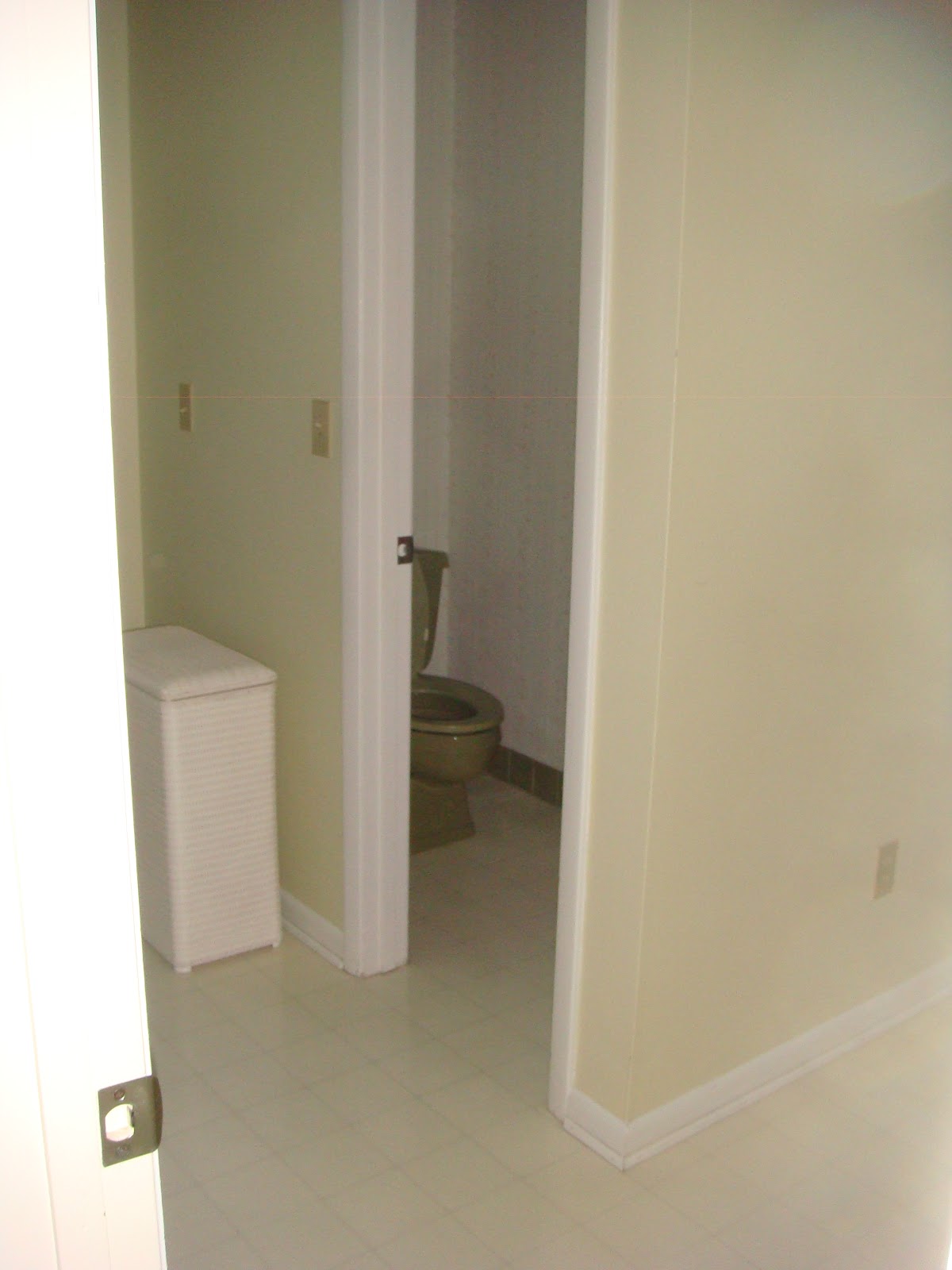
And then we have the olive green phenomenon known as the bathroom. There are two external windows, one in the bathtub wall (weird?) and one above the toilet. Both were replaced and I think they did a great job, but I don't get the green tile!! I could have made this whole room work without those vertical stripes of green tile. There is a toilet on the other side of the tub wall (to the left of this picture).
Sure enough, that toilet is green.
Leading from this bathroom, through another door, is the laundry room. There is an open area on the right that we are going to make into hanging dry racks, with a shelf for storage. You can see in the picture below, the doorway leading from the laundry room into the bathroom, as well as the open area for the new storage.
And here is the rest of the open area, that also shows a smidge of the washer and the door that leads back to the hallway on the foyer side of the house.
On the left side of the laundry room is the new washer and dryer, a utility sink, and a door that leads to the pool deck. I like that this is a pool bath, but the laundry room included with all the doors makes it very inefficient. This is the room with the wall color that I actually love, though, so win-win for that one (genuine statement #2).
Alright, that covers the 3 bedrooms on the right side of the floor plan. Now all we have left is the master bed & bath. The master bedroom has two entrances: the family room & the garage. Come on now, we all need a clean egress point for many reasons (ahem!). So here is the first view of the master, with a window to the backyard, and the doorway to the family room with the brown paneling.
This picture shows the master bedroom from that doorway, leading to the
hotel motel-like connection to the bathroom. Oh we have our own off-centered chandeliers here though. You can see, there is more wallpaper, combined with an off-the shelf vanity. You can also see the door that leads to the garage on the left side of the picture and the doorway that also goes to the closet (behind the wall on the right).
The walk in closet is a decent size. Both my husband and I can fit all our hanging clothes and shoes here, without extra shelves or more organizing space.
A heads on shot of the vanity, with the chandy, and the alarm system, since this is a door that goes to the garage. And of course, what motel bathroom would be complete without carpet???
Here is the left half of our "bathroom", which leads to the more functional part of the space (the shower and toilet). It is TINY!
The shower stall, which used to have a tub, based on the faucet being at foot height, is a decent size, but the doors are leaking, which has caused a mildew issue on the bottom left corner of the wallpaper, seen in the picture below (no you can't see the mildew, but when I go to fix it, I'll show you). At least they tiled here!!!
And there you have it! My first official house tour.


Anonymous | September 24, 2012 at 5:00 PM
Our old house (do you remember) had the backward front door too. I made Tony replace it. Great light fixtures. Can't believe you aren't saving them. XXOO Frances
Rebecca | September 24, 2012 at 5:52 PM
I loved your Elephant bathroom! I may keep them for a play I'm writing about swingers in the 70s....